Flexible Workflow: Quick Order

Company: Advisr
Role: Product Designer
Device: Desktop
Tools: Figma, G Suite

The CEO identified that our campaign workflow was too rigid and wanted to introduce more flexible workflows to support a wider range of use cases.

Users must navigate through multiple required pages even when certain steps are unnecessary, making campaign creation feel repetitive and tedious.

Key Pain Points


Redundant steps

Users are required to complete multiple pages even when inputs aren’t needed.

Lack of flexibility

The workflow does not adapt to different campaign types or user scenarios.


💭 Proposed Solution: Work Backwards

Redesign the campaign creation process by prioritizing what’s most important to the user.

  • Allow users to skip ahead to Product Selection and Budget Allocation.
  • Require only Campaign Name and Company Selection to unlock product options.
  • Enable real-time collaboration to review products and adjust budgets with clients.
  • After selections are made, direct users to a Campaign Summary Page to complete remaining details.

My Role As the Product Designer, I led the design of the feature’s structure, visual treatment, and interaction flows,

ensuring the scores were easy to understand and motivating to use.

Quick Order Design Highlights

Redesign the campaign creation process by prioritizing what’s most important to the user.

  • Accessible via the Create Menu and My Workspace
  • Users can start a campaign by simply selecting a company and naming the campaign
Team Collaboration

Stakeholder

CEO of Company provided the ask and provided feedback

Product Manager

Gathered requirements, oversee the project & facilitated meetings

Dev & QA

Build the feature and worked closely with QA to ensure it was implemented correctly

Marketing

Worked on one sheets and other customer facing assets

CS

Provided customer insights and helped onboard features to customers

My Role

I worked closely with Product Manager & Stakeholder to create design options, validate design decisions and hand off wireframes

Process Steps
1. Gather Documents & Requirements
  • Talk with Stakeholder to discuss what is needed
  • Work closely with Product managers and gather requirements
2. Brainstorm with team & ideate
  • UI and Competitive research: Look into how other platforms treat campaign or project creation.
  • Create a PDF on research & share initial design ideas with Product team
  • Brainstorm with Product team and narrow down on Design options
3. Lo-Fi Wireframes & Feedback
  • Create Lo-Fi wireframes based on approved design options
  • Create prototypes and share lo-fi wireframes with stakeholders & other team members to gather additional feedback and make adjustments when needed.
4. Implementation
  • After making needed adjustments, create hi-fi wireframes using Advisrs UI patterns
  • Share wireframes with marketing team for  one-sheets and onboarding assets
  • Present final designs with stakeholders and keep CS informed so they can communicate with their customers

Campaign User flow

The user had to through multiple pages when creating a campaign

Pain Points

Workflow feels rigid

Going through the same steps felt repetitive

Summary Page*

Where user fills in important info like Company, Budget, Goals etc (Required)


Audience:

Users can edit target audience settings

Geo:

Users can edit geolocation

Product Selection*

Select from a list of products (Required)


Budget Allocation*

Set the budget for selected products (Required)


Quick Order Userflow

We simplified the campaign creation from multiple pages

to a single page

Requirements

  • Company dropdown to populate product tiles
  • Name input field is needed in order for the 
Campaign to be created

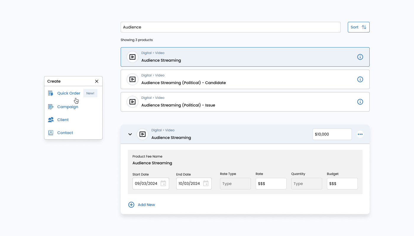
Accessing Quick Order

Users can access Quick Order via the top navigation
or a Quick Order CTA in other parts of the platform.

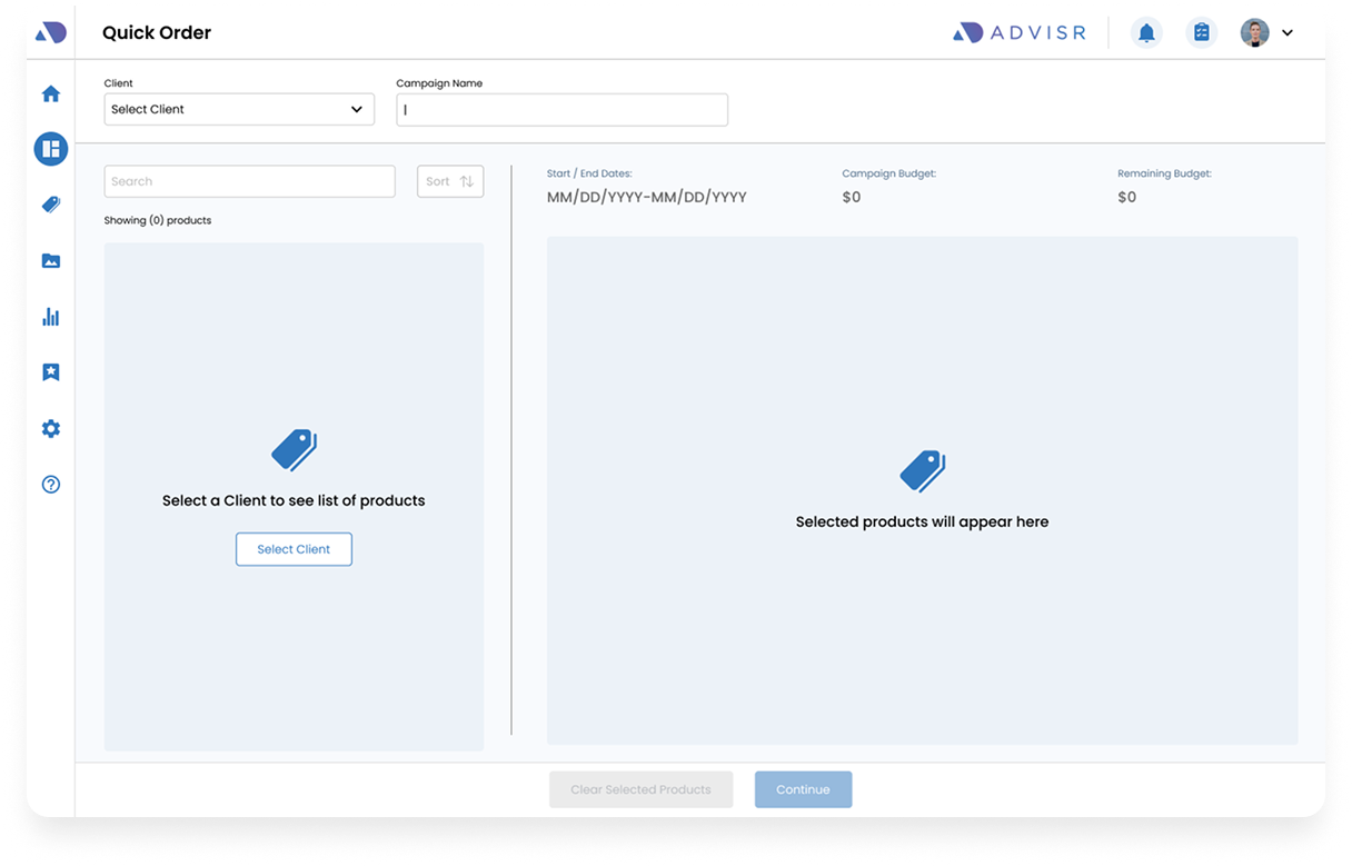
Quick Order Page

  • Users land on the Quick Order Page
  • The default state will be empty and the user is prompted to select a client in order to populate products
  • User is required to enter a unique campaign name

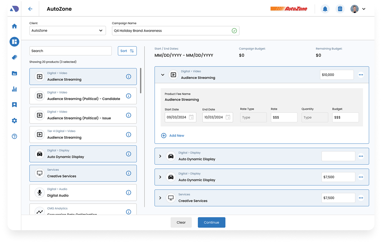
Product Selection & Budget Allocation

  • Once the user selects a client, products will populate on 
the left panel.
  • Product cards will appear on the main section and users can
adjust the budget allocation
  • Users need to validate the budget in order to continue to the
 next step

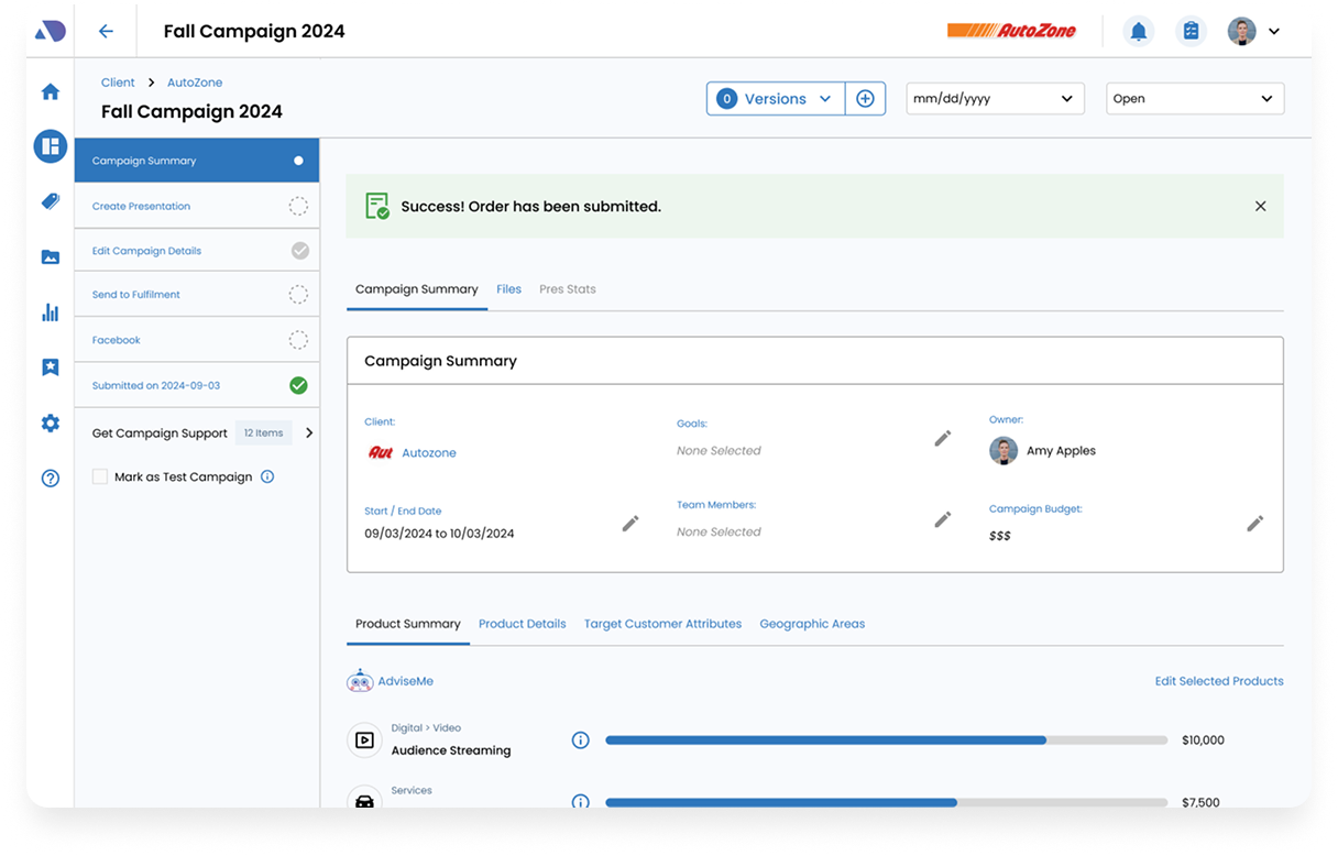
Campaign Summary Page

Once the user validates the budget allocation, they land on the Campaign Summary page where they can make additional updates if needed.
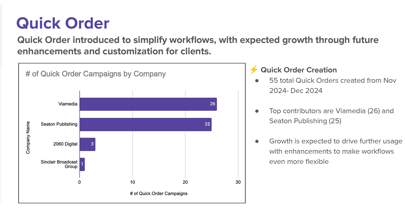
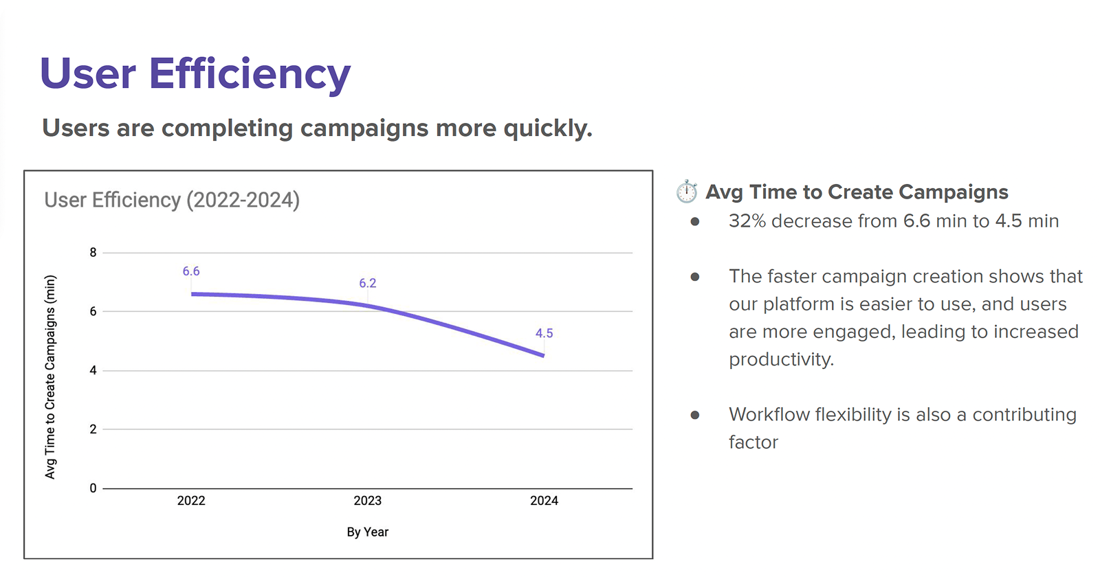
Stats

Takeaways

  • A user liked that they were able to calculate the budget and show their clients in real time.
  • Made campaign creation quicker and they are still able to make updates to the other sections

    w/o having to go through all those steps in the beginning via the old flow.
  • Sales team felt it demo’d well when pitching the Advisr to Clients.