Trebuchet Dashboard

Company: HBC
Role: Product Designer
Device: Desktop & Mobile
Tools: Figma, G Suite
Overview

The  Engineer & QA team use the CNS dashboard to deploy & test transactional emails for Saks and Hudsons Bay.
It was initially put together by an engineer but I was asked to look at the design and make some UI and functionality improvements.

Team Members & Collaborators

This initiative was brought to life through close collaboration across several functions:

Product Manager

Responsible for gathering requirements and facilitated meetings.

Dev Team

Build the platform and helped provide context that helped with design. Implemented the new designs.

My Role

Worked closely with the PM and Dev Team to brainstorm solutions. Created wire frames and ran usability tests to validate design decisions.
Handed off design to Dev and help QA to ensure it was implemented correctly.

Process

Empathize
  • Identify the pain points
  • How can we improve the functionality of the dashboard?
  • Stay informed with in-app and email notifications
Define
  • Create Visual Hierarchy
  • Research and look at UI patterns so that it feels intuitive.
  • Stay informed with in-app and email notifications
Refine
  • Start out with low-fi wireframes to figure outthe userflow
  • Share with the team and get recommendations on what to improve Repeat...
Build
  • Once the userflow is fleshed out
  • Create hi-fi wireframes and prototype
  • Work with dev, using Zeplin to hand off files.

Identifying the Pain Points

I set up a meeting with the stakeholder and dev team to get more context on how the page was build and to also get some 
of their feedback on how they use the dashboards and what their pain points were.

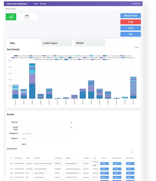
Not User Friendly

At first glance it is hard to know where to start because of the lack of hierarchy and overall feels really busy.

Unclear Functionality

It is unclear what happens once the user clicks on one of the CTA’s on the top right (Do all the content in the page update?)

Information Hard to Scan

The graph is hard to read and the information is hard to scan in the email section since there are a lot of columns.

Content

  • How can we improve the layout so that it feels intuitive?

  • How can we make the information easier to digest so that it can be shared externally to other teams? 

  • What elements can we refine and what can we can rid of? With those questions in mind, I first started a rough sketch to get an idea of the user flow.

Sketch to Low Fidelity Wireframes

After sketching, and getting a better understanding of what the initial layout will look like. I then created low fidelity wireframes on Sketch.

This helps iron out some details that felt like good ideas at first and gives me an idea of what to improve.
Statistics Page

Old Layout

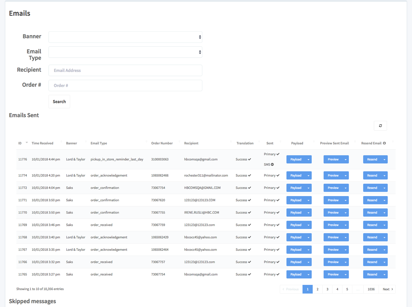
The previous Emails page was difficult to scan due to the number of columns on table and the lack of visual hierarchy.

It wasn’t immediately clear which information was most important, making it harder for users to focus.

Additionally, the call-to-action buttons felt repetitive, and
several were non-functional, leading to confusion and inconsistent interactions.

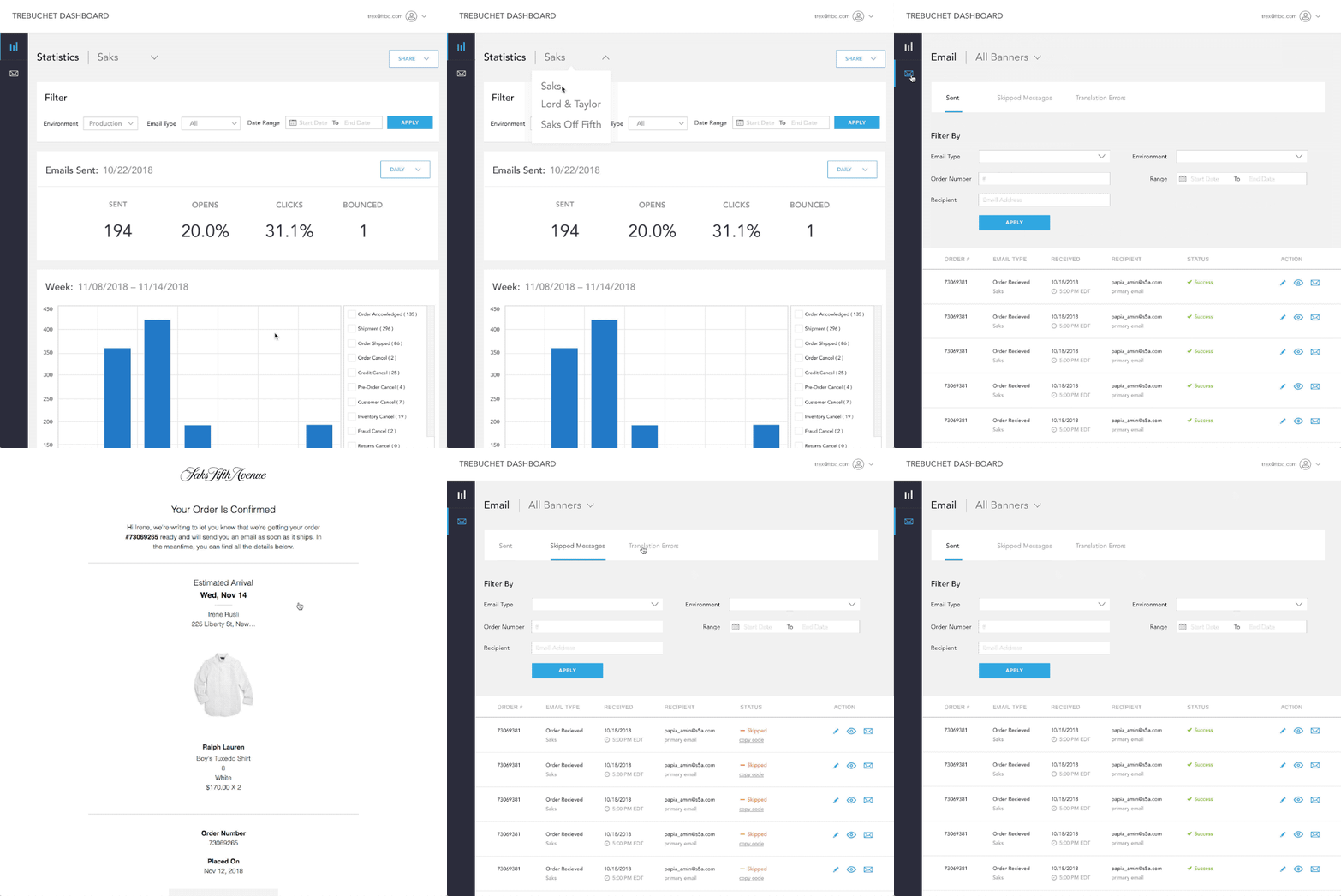
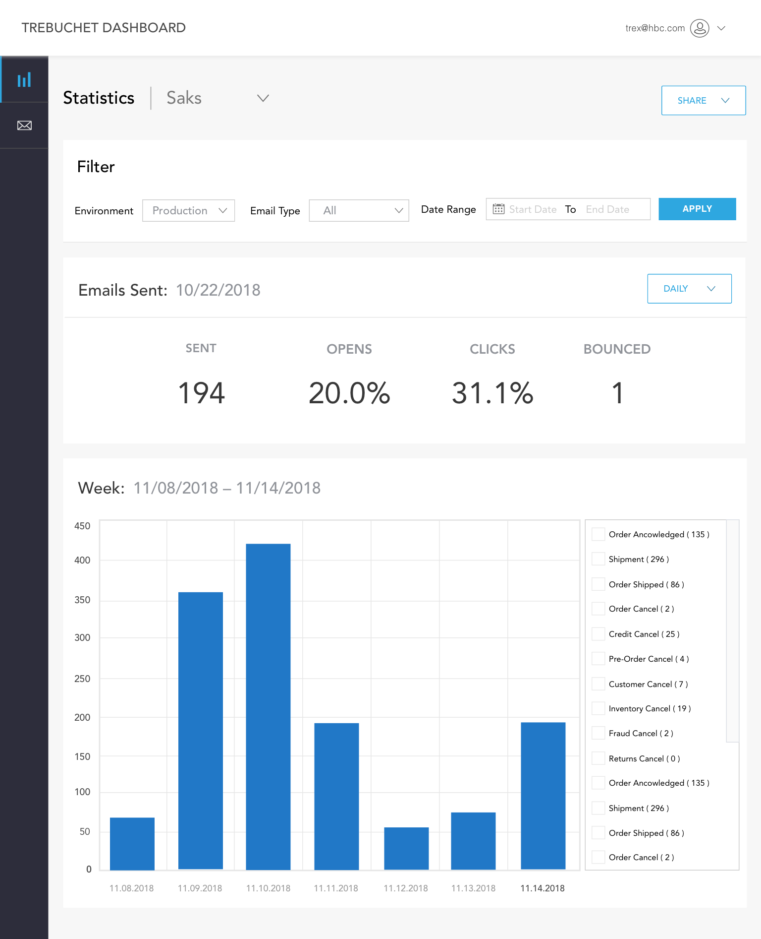
New Layout Improvements

Navigation

Left hand nav so User can view stats and email

Dropdown

Quick access the different companies via dropdown


Filters

Users can filter by Environment, Email Type and Date Range


Hierarchy

Improved the layout by creating hierarchy through typography

and UI elements. Labeling each section so it is easier to digest

Email Dashboard Page

Old Layout

The previous Emails page was difficult to scan due to the number of columns on table and the lack of visual hierarchy.

It wasn’t immediately clear which information was most important, making it harder for users to focus.

Additionally, the call-to-action buttons felt repetitive, and
several were non-functional, leading to confusion and inconsistent interactions.

New Layout Improvements

Tab Navigation

Emails are now organized by status using a tabbed navigation system, making it easier for users to view emails via status.

Simplified Table Design

The old table contained 11 columns, which made the layout cluttered and overwhelming. The new design reduces this to 6 columns, creating more white space and improving readability.

Improved Usability

Key updates include the addition of icons for actions and color-coded statuses, allowing users to quickly identify the
 state of each email and take action with less effort.

Prototype & Build

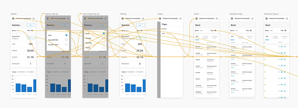
After a few rounds of refinement, I went ahead and designed for the mobile screens and created a prototype to present
to the team before hand off.

After Sign Off, I would go ahead and hand off the Zeplin file to the dev team.

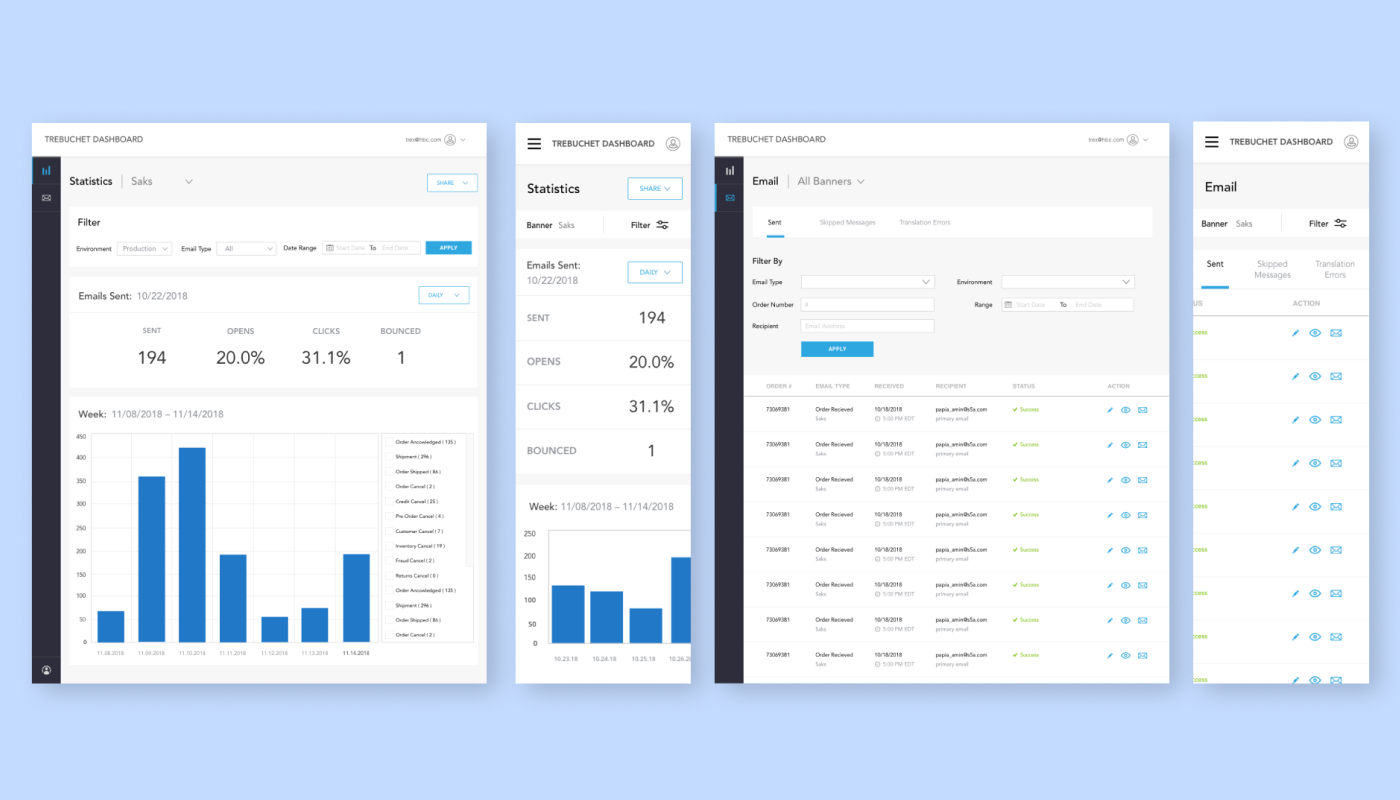
Desktop to Mobile

The dashboard was designed to ensure a consistent experience between Desktop & Mobile

Conclusion

Overall, the engineers were really happy with the updates.
It made their everyday work a lot smoother.