SaksFirst Landing Page

Company: Saks
Role: Visual Designer
Device: Desktop & Mobile
Tools: Sketch, Invision
Overview

Saks launched an initiative to refresh its Loyalty page, which had not been updated in several years and felt outdated.
The goals were to modernize the design, improve messaging, address user pain points, and make the page easier to update.

Requirements
  • Make the page dynamic and easily updatable
  • Incorporate clearer, updated program language
  • Add a dedicated section for Marketing promotions and events
  • Improve login and balance-check experience
Team Collaboration

Loyalty Team

Project stakeholders who manage the loyalty program. They provided updated program language, customer insights,
and requirements.

Marketing Team

Created brand and promotional assets (logos, images, icons etc). They supplied creative for events and promotions.

Dev Team

Engineers and QA responsible for translating designs into code and ensuring accurate implementation.

My Role

Work closely with loyalty team to brainstorm on how to make the content easier to digest.
Provided guidelines to marketing team on what creative assets were needed.
Handed of designs to the dev team and helped QA.

Old Landing Page Experience

Old Layout

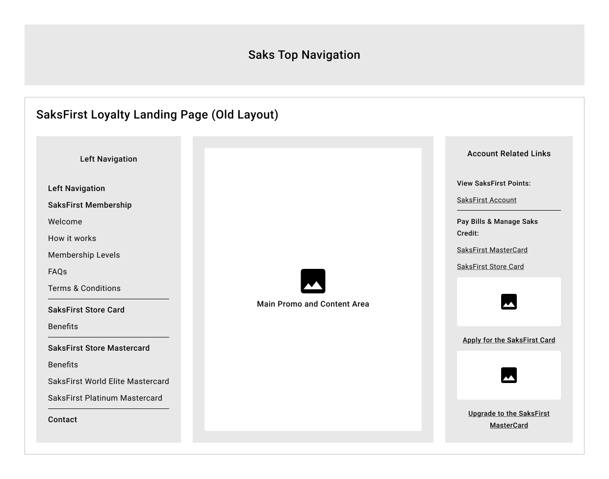
The old layout consisted of 3 sections:

Left: Navigation menu for switching pages

Middle: Main content area (changed based on left nav selection)

Right: Account tools (bill pay and SaksFirst account management)
Pain Points

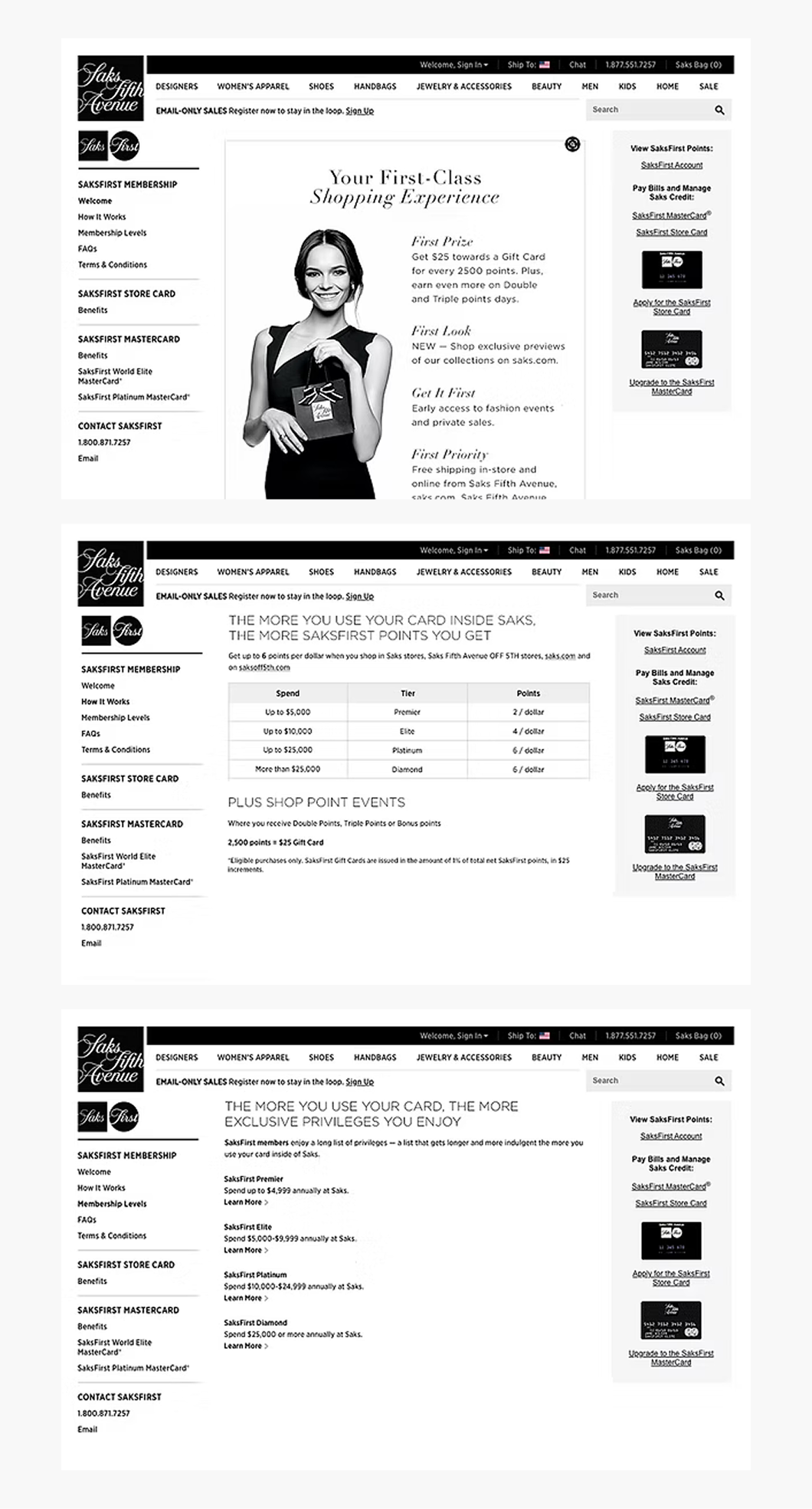
Too many clicks

the user has to get the information by clicking on the links on the left hand nav.

Hard to compare tiers

It's important to be able to compare the different tiers and perks, they all exist in their own page so the information doesn't feel cohesive. 

Outdated design

The overall look feels outdated and wasn't responsive. The copy also didn't feel friendly and would often run too long

New Landing Page Experience

Proposed Layout

Content hierachy

Establishing content hiearchy to make it easier for users to read the content and get a better understanding of the program.

From multiple pages to single page

Turning pages into sections. Making navigating content easy with the use of a sticky subnav.

Responsive and dynamic layout

Using dynamic text instead of static images and responsive breakpoints to ensure a consistent experience between desktop and mobile.

SaksFirst Beauty Landing Page

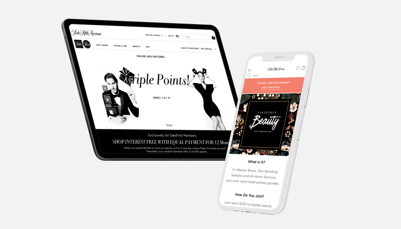
SaksFirst Beauty is a tiered rewards program from Saks Fifth Avenue, created exclusively for SaksFirst credit card holders.

Members earn access to curated “Beauty Boxes” filled with deluxe samples from luxury beauty brands when they shop beauty
with their card.

To better showcase the program, the loyalty team requested a dedicated landing page highlighting each Beauty Box and the rewards members can unlock at different spending tiers.
Takeaways

  • The Loyalty team was happy with the updated design.
  • They felt it was easy to manage the content and the dynamic text vs jpg helped with SEO.
  • Because of the success of the SaksFirst landing page they were able to use easily
    create a landing page for SaksFirst beauty.
  • Users felt the sticky sub-nav made it easy for them to jump to a section as
    well as manage their account.