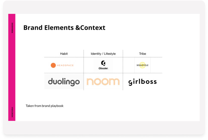
MoneyGirls is a financial advice platform dedicated to empowering young women.
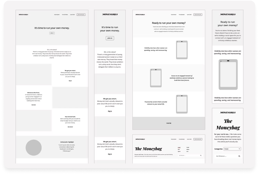
With a growing community through their social media and strategist program, they were ready to expand their offerings with a new app.
As their content and audience evolved, they sought a refreshed brand identity.
I collaborated closely with the founder, content strategist, developer, and social media team to understand the brand’s direction and identify key areas for improvement.
This initiative was brought to life through close collaboration across several functions:

For the refresh, the founder wanted the logo to feel less collegiate since
they are expanding to post graduates.

The original logo was meant to feel more collegiate
with the use of navy blue.
The logo mark was a bird that was meant to represent financial freedom and an abstract version of the letter “M”.
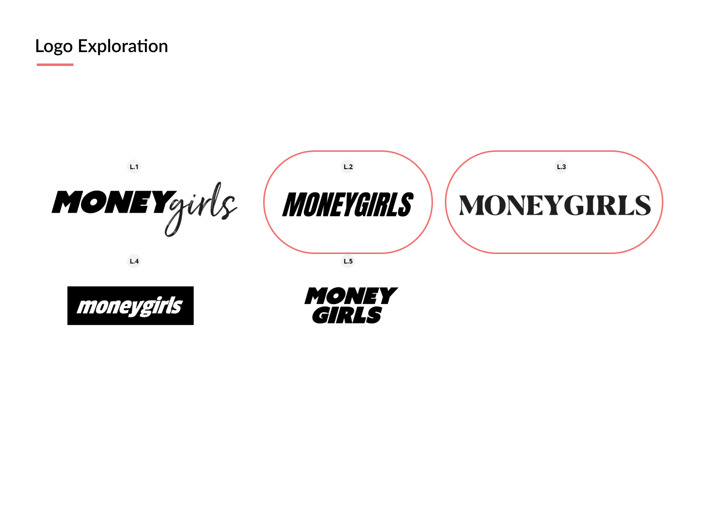
Logo Explorations
-
I shared the designs with my team members
as well as some of the actual clients.
The founder liked the Italic font because it shows movement.
Overall they liked the serif font because it felt editorial.
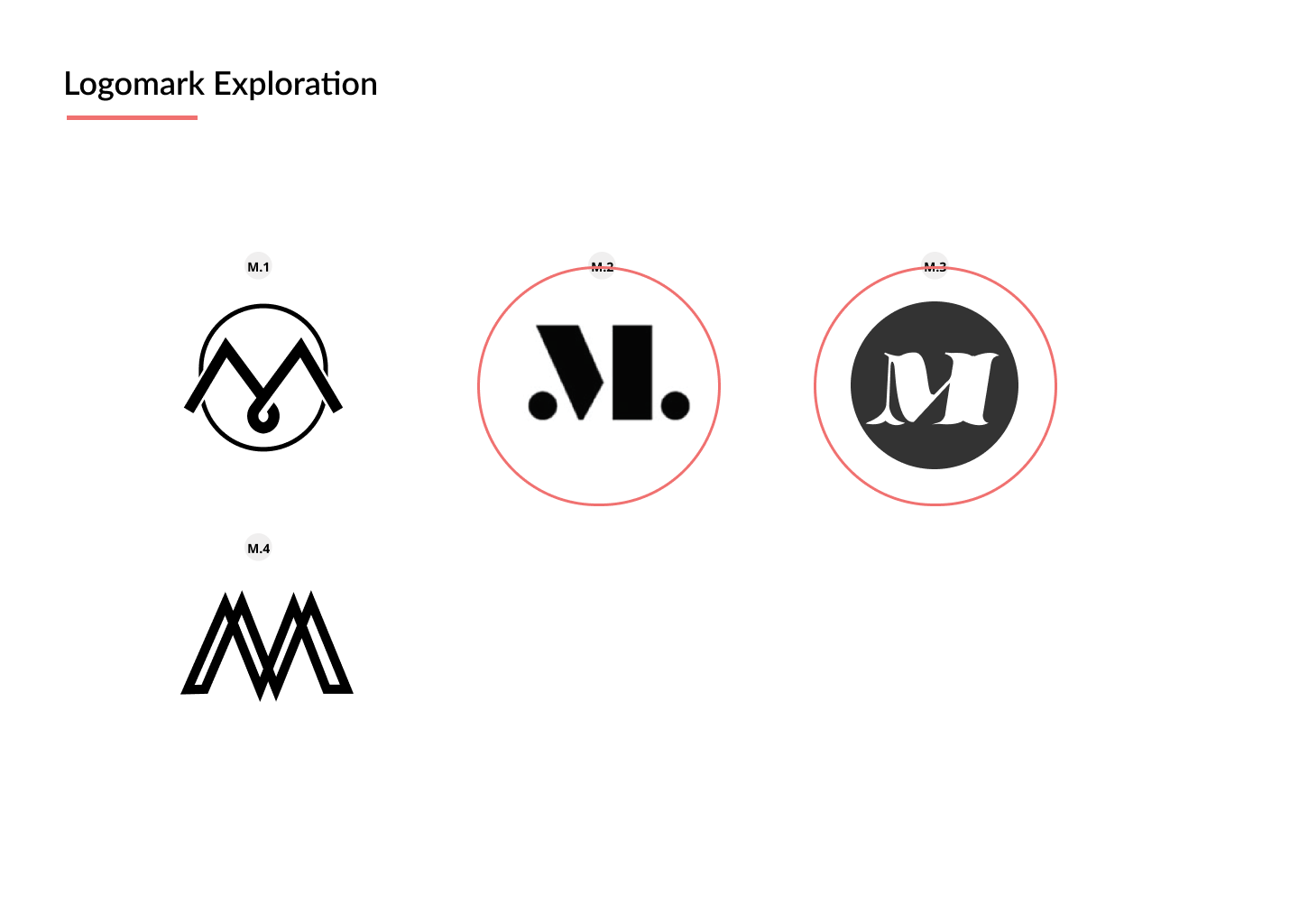
Logomark Explorations
-
They liked the dramatic shapes of M2 and M3.

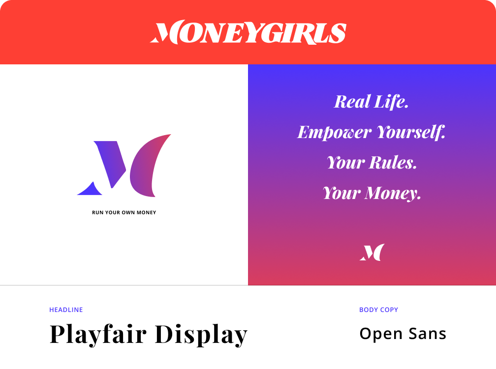
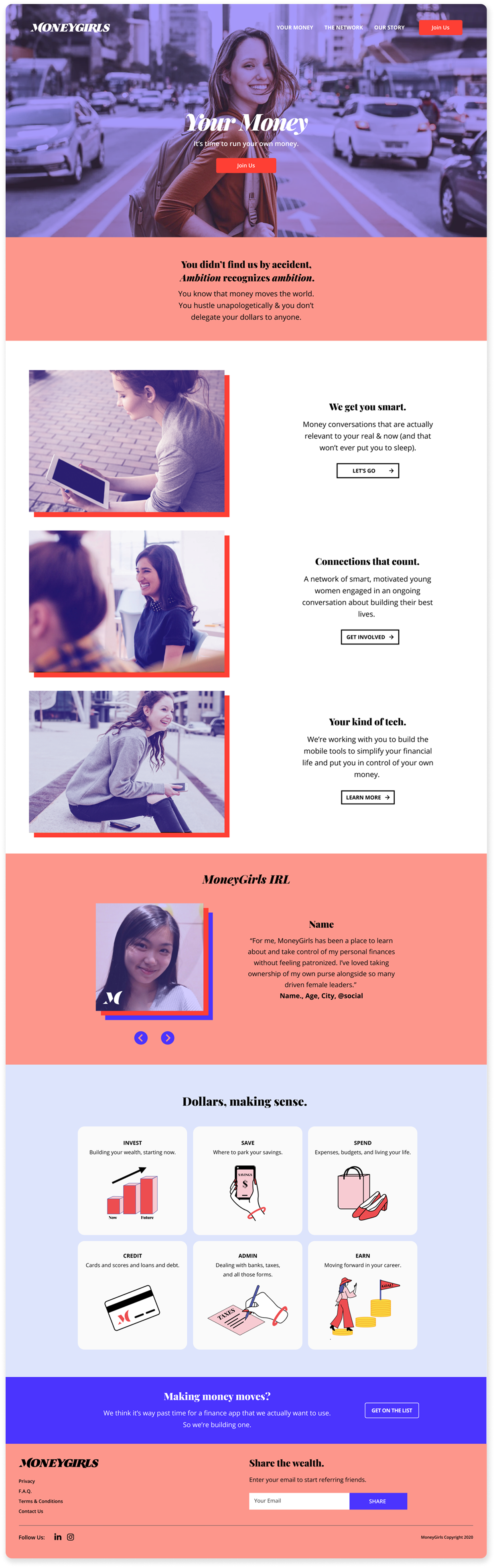
Final logo shows movement and a more editorial and less collegiate.
Branding elements with updated color palette that feels more energetic.
Typography: For headline a editorialized serif font paired with a monosans body copy.
I also explored how the logo can look like with animation

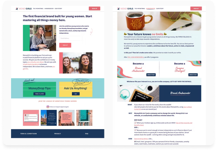
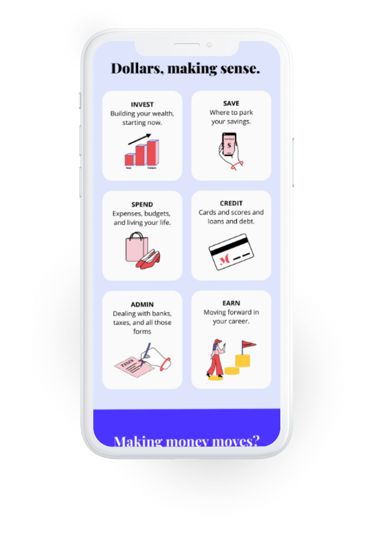
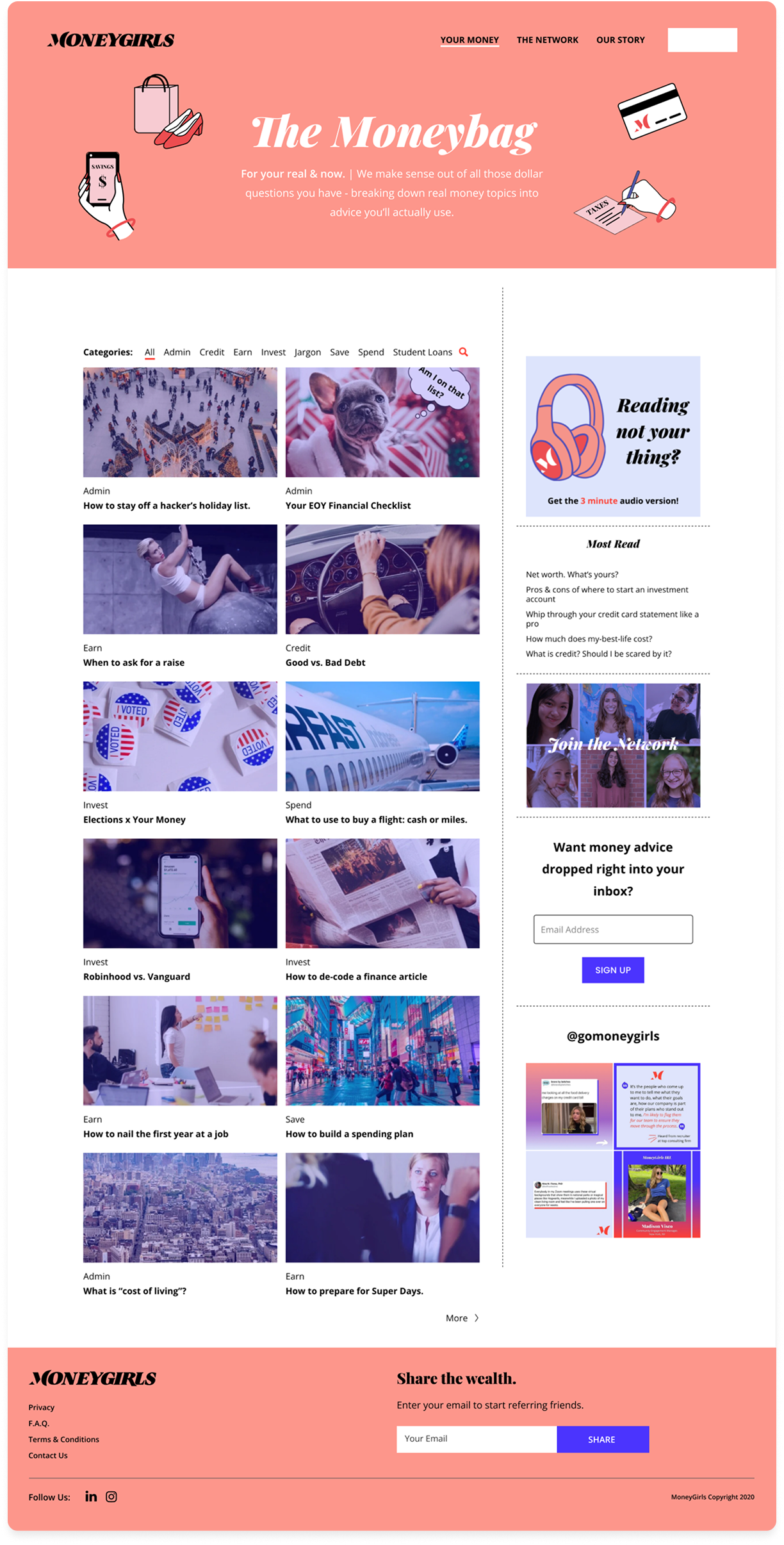
Using more realistic & relateble images without feeling too "stock image-y".
Ex. Showing a group setting meant to empower and show community.


The founder wanted the illustration to feel playful and irreverent.
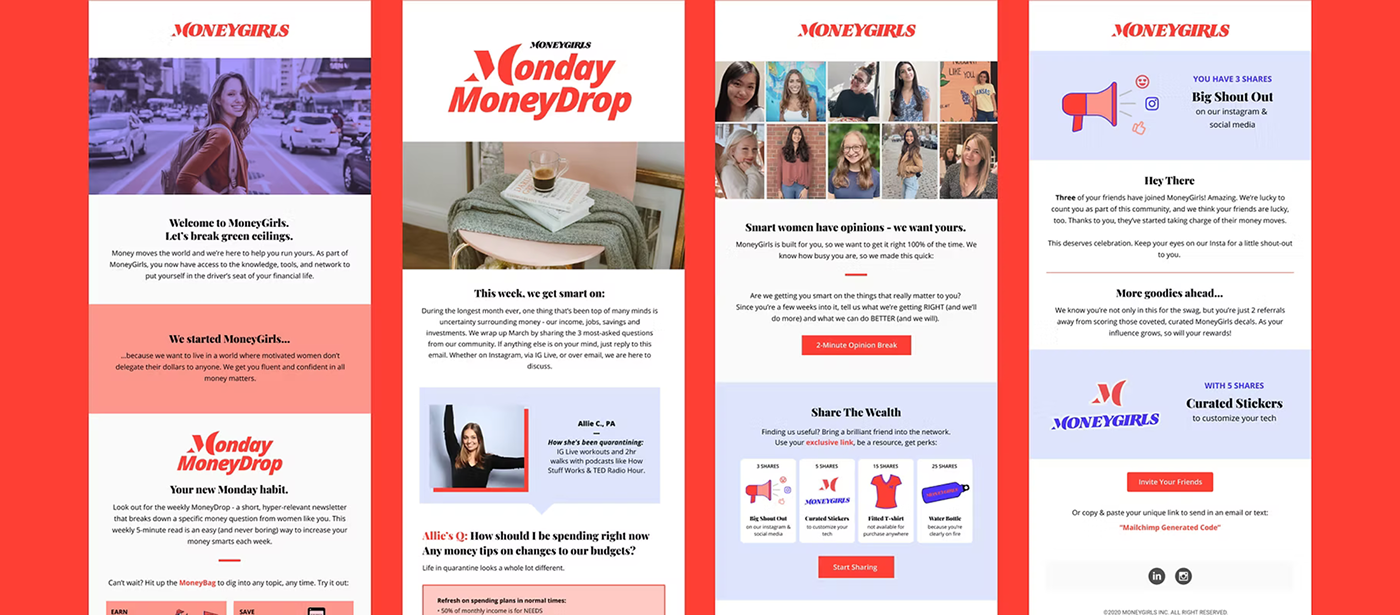
The illustrations were used for Blog Posts, Emails, Marketing Collateral and Stickers.


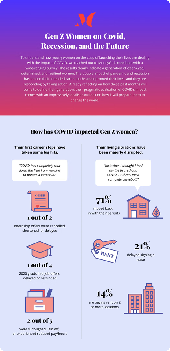
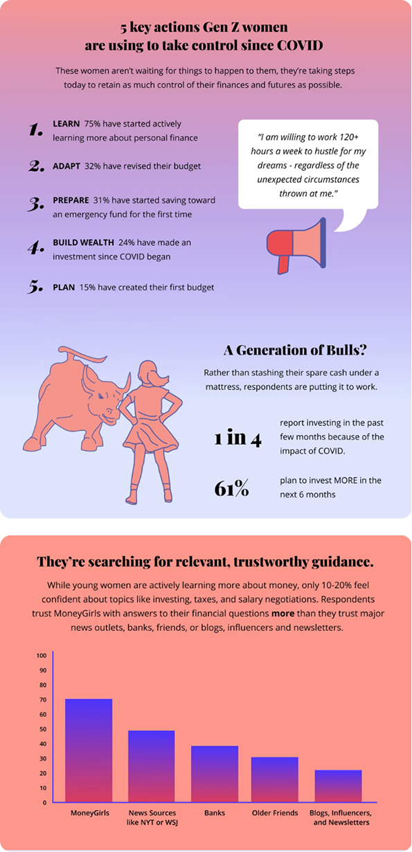
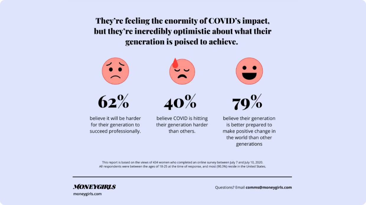
The project happened right when Covid started. It was a time of global health and economic instability.
Financial literacy was more important now than ever and the core demographics of this platform was affected.
We created Infographics to reflect the changes that were affecting Gen Z.