A Case Study for an Action-Oriented Landing Page

Company: Advisr
Role: Product Designer
Device: Desktop
Tools: Figma, G Suite

Over time, the homepage became outdated and underutilized. Instead of starting there, users defaulted to the Workspace page, where they could more easily track clients and campaigns.
This left the homepage feeling irrelevant and disconnected from daily workflows.

As part of the Flexible Workflows initiative, the product owner identified this as the right moment to redesign the page.
The goal was not only to modernize the layout but also to reposition the homepage as an action-oriented hub that supports productivity.

Pain Points

  • The page felt static and underwhelming.
  • The campaign table (the only valuable element) was buried at the bottom.
  • Stats at the top didn’t add value and wasted real estate.
What We Wanted to Achieve

  • Give users a clear snapshot of their activity
  • Help users on actions they needed to take
  • Showcase Advisrs features
Team Collaboration

Product Manager

Responsible for gathering the requirements and facilitating meetings between the different teams.

QA & Engineer

Worked closely with Engineer to build the feature and the QA team to ensure feature is implemented correctly.

Customer Service Team

Provided some customer insights and added feedback to help shape the product.

Marketing Team

Provided text as well as worked on one sheets and other customer facing communication.

My Role

As the Product Designer, I led the design of the feature’s structure, visual treatment, and interaction flows.

Old Homepage Design & Navigation Updates

    Pain Points

    • Users did not really find the data useful. Users could just go to the reporting page to view comprehensive data.

    • Charts & Graphs took up a lot of real estate and buried the recent campaigns table.

    • Users were not aware of what action to take (ex. no call to actions, no activity feed).

    Navigation Updates

    Left Navigation

    The left navigation was revamped and it was a decision to 
remove the home button on the left nav since it was not being used.

    My Workspace

    Main hub where home, sales activity, clients, campaigns and additional modules will appear.

    Brainstorm & Ideation

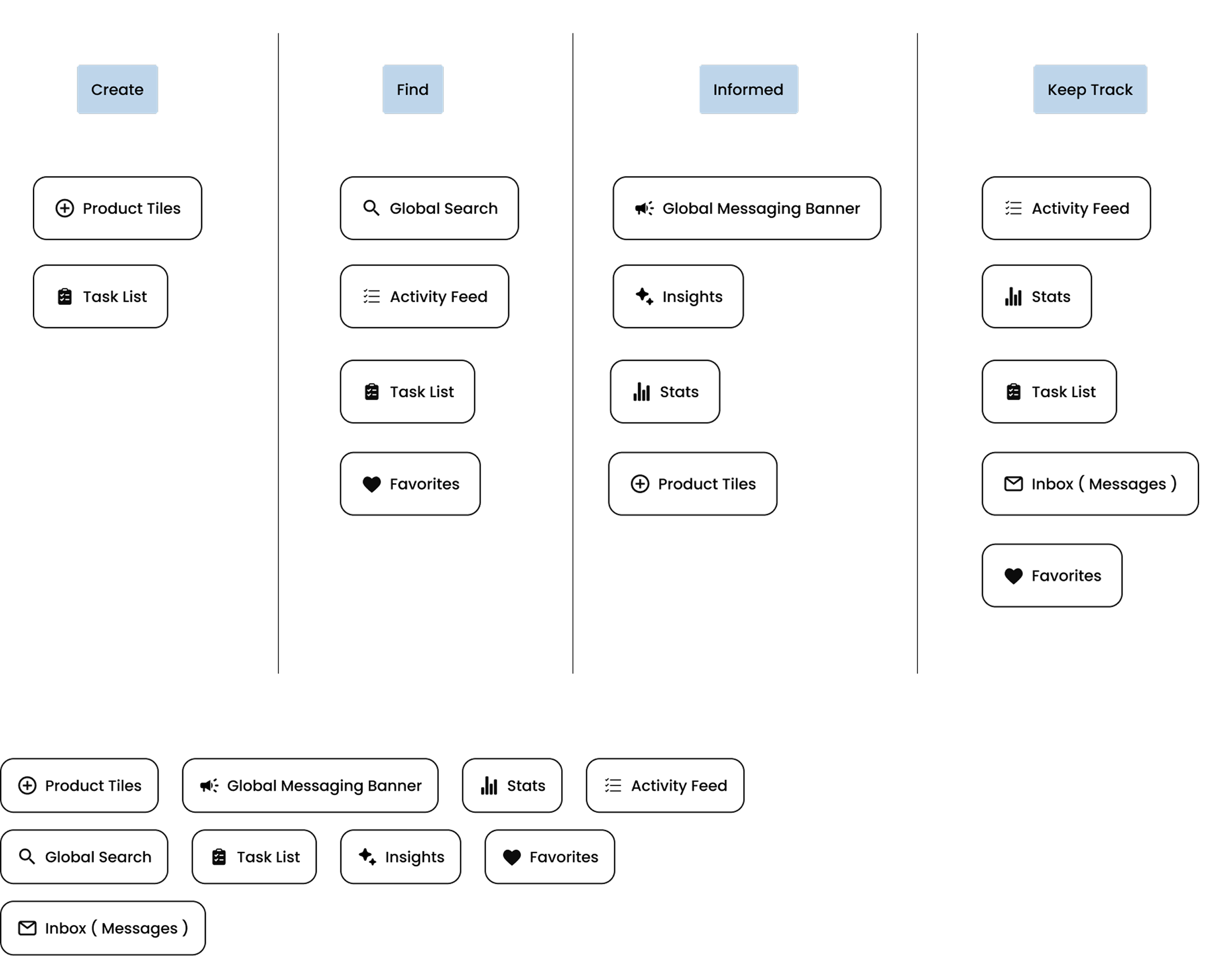
    To ground the redesign, we mapped user needs into four simple themes:


    Create

    Get work started quickly

    Find

    Locate campaigns, files, or content

    Informed

    Stay on top of reminders and updates

    Track

    Pick up where you left off

    These themes became our design anchors, helping us focus on what mattered most to users

      Possible components based on the 4 themes.

      We thought of existing or upcoming features
      we can use as components on the homepage.

      UI Components

      We broke the homepage into modular, reusable components.
      This component approach made the design flexible and scalable,ensuring it could adapt to future needs.

      Action Tiles

      The tiles will be used to highlight Advisrs different features/modules

      Usage Examples:

      • Take users to campaigns page
      • Help users with what actions to take

      Cards

      The cards will contain information related to user actions:


      Usage Examples:

      • Activity Feed
      • Messages
      • Task List
      • Favorites

      Global Messaging Banner

      The global messaging banner will rotate through different messages

      Usage Examples:

      • Alerts/Notifications
      • Marketing related
      • AdviseMe

      Design Options

      As part of the design process, I explored different layout structures to balance quick actions, main content, and supporting features.

      The goal was to create a workspace that felt both efficient and easy to scan, while adapting to different user needs.

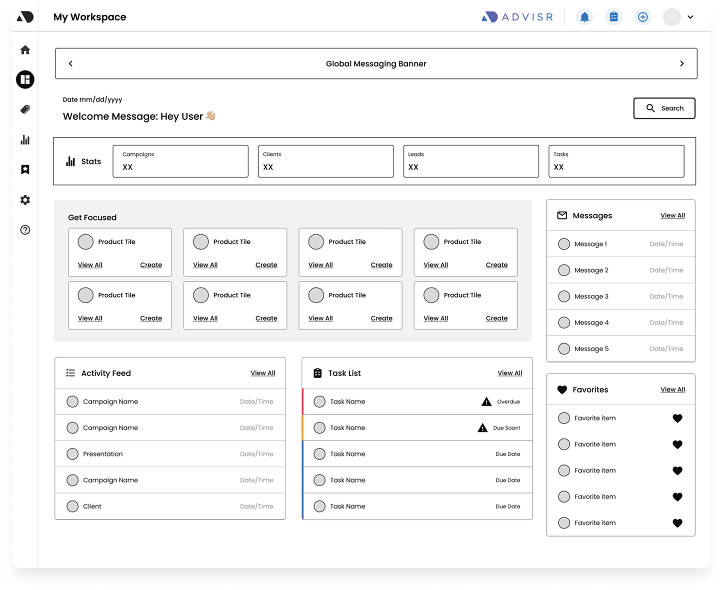
      Comprehensive View

      Look

      • Grid based structure to show multiple information at once
      • Action tiles take up full width
      • Cards appear on the bottom


      Benefit

      Predictable and structured, ideal for users who value consistency.

      Feedback

      • They liked the get focused section and how prominent it was
      • Cards next to each other felt busy

      Focused Workflow

      Look

      • Wide central area with tabs for navigation
      • Right Panel with action tiles

      Benefit

      Spacious and focused on primary content, with less visual clutter.

      Feedback

      They felt that the layout looked clean and they liked that they are able to switch through the tabs

        Widget based workspace

        Look

        • Modular layout
        • Widgets take up most of the focus
        • Quick Actions section takes up 3/4th of the page width

        Benefit

        Balanced view that surfaces activity, updates, and tasks at once.

        Feedback

        While it highlighted Advisrs features. It felt busy and they felt it was hard to focus on one thing.

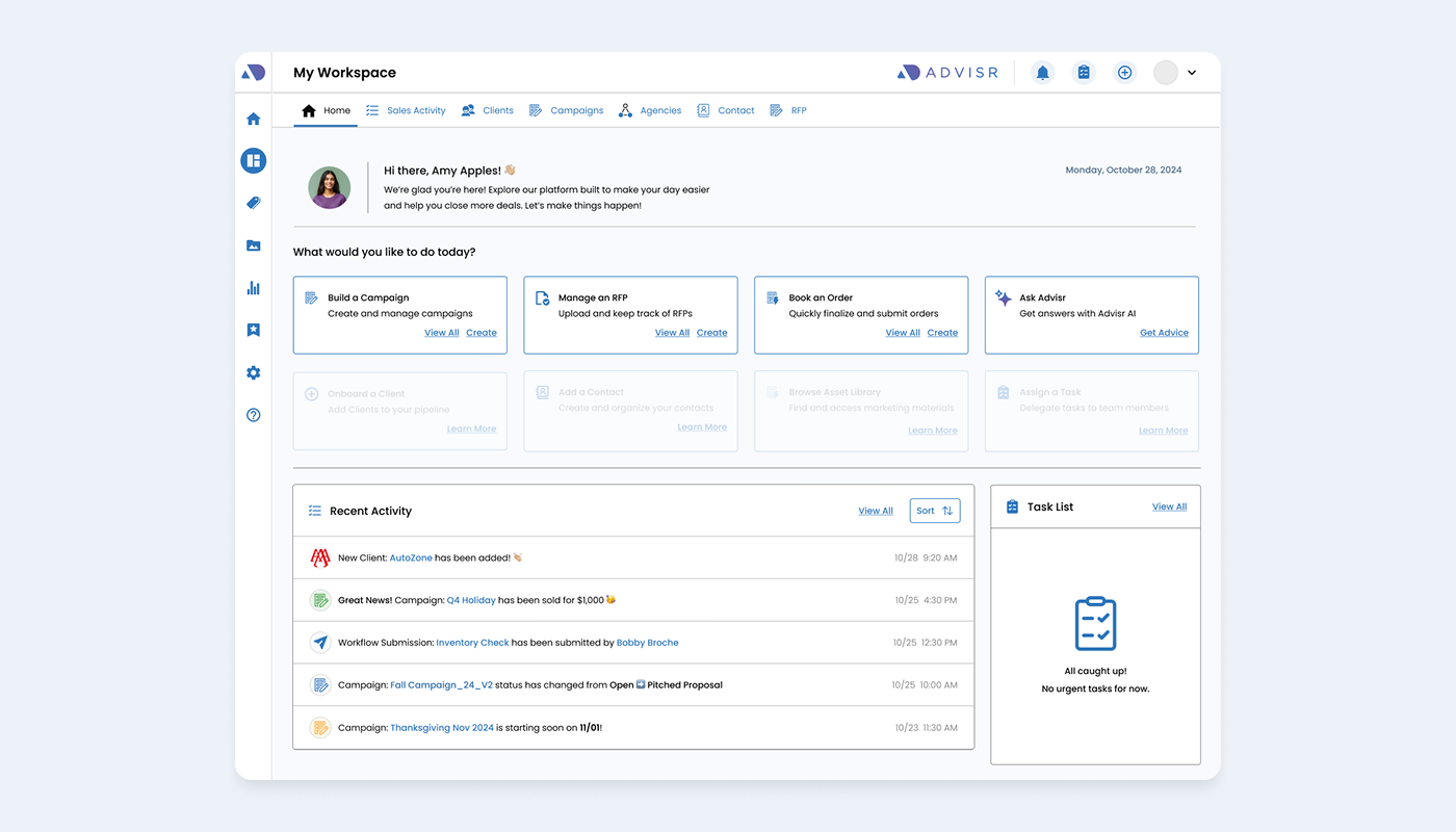
          Final Design based on feedback

          This is a smart combination of all three.

          It's built for speed and lets you see all the most important information at a glance.

            Final Design

            We launched with Product Tiles, Activity Feed and Task List and will continue to roll out other components in the future.

            • New users will see Recent Activity and Tasks cards in an empty state
            • The cards provides more text which helps onboard features
            • Once the user starts to create campaigns or uses task, the cards populates a list
            • Added interactions like tooltip on hover which give users context without compromising the design

            Takeaways

            User Feedback

            • CEO was happy with the redesign and liked that it showcased what Advisr could offer
            • Users liked that they could keep track of their recent activity
            • Users felt the quick actions section was helpful