Hudsons Bay Company: Size Chart

Company: Hudsons Bay Company
Role: Product Designer
Device: Desktop & Mobile
Tools: Sketch, G Suite, Zeplin
Overview

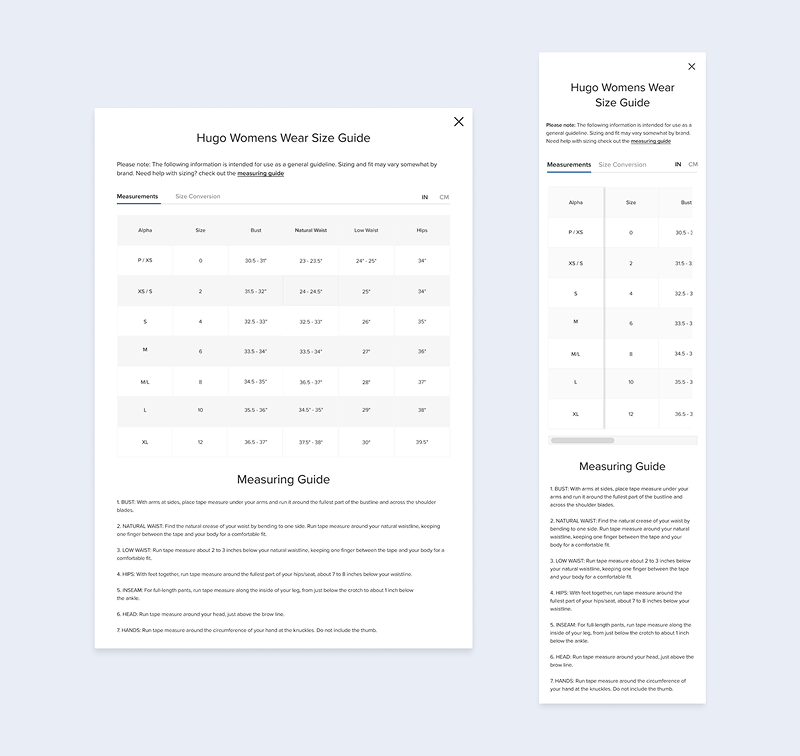
The Size Chart required a major update. It didn’t align with best practices and offered a poor user experience.
Managing the charts was also cumbersome, as most relied on outdated static images instead of dynamic text.

Partnering with a UX Researcher, we conducted usability tests and interviews to redesign a responsive,
user-friendly size chart optimized for both desktop and mobile.

Requirements
  • Make the size chart component dynamic for easier maintencence
  • Flexible layout to cover the different size charts for each category
  • A way to easily switch between measurements and size conversions
  • Responsive layout for app and mobile site
Team Collaboration

Senior UX Manager

Provided the initial concept and requirements. Provided design feedback and facilitated meetings.

Product Manager:

Provided context about how size charts are maintained. Responsible for managing the size charts along with the merch team.

Dev Team

Engineers and QA responsible for translating designs into code and ensuring accurate implementation

My Role

Work closely with the Sr. UX manager and product managers. Create designs based on the requirements and feedback from team members.

Old Design

Size Chart Improvements

  • Size chart opens up as a modal
  • Category based so its easier to show the user the right size chart instead of scanning the page
  • Fully dynamic with live text for better data input and makes it easier to manage size charts

  • Cleaner table design that adapts to screen size
  • Added tabs and toggles to make it easier to switch between difference size charts and conversions

Hover State

Introduced interactions like hover states to help users find their size easier

Responsive Design

Modal is responsive and adapts for different screen sizes and devices.

Takeaways

User Feedback

  • The merch team were happy the update because it made managing size charts
    easier with the use of dynamic text
  • Responsive layout ensured a consistent experience on desktop and mobile
  • The updated table design with hover state made it easy for users to find their size
  • Finding the conversions was easy because of the toggles