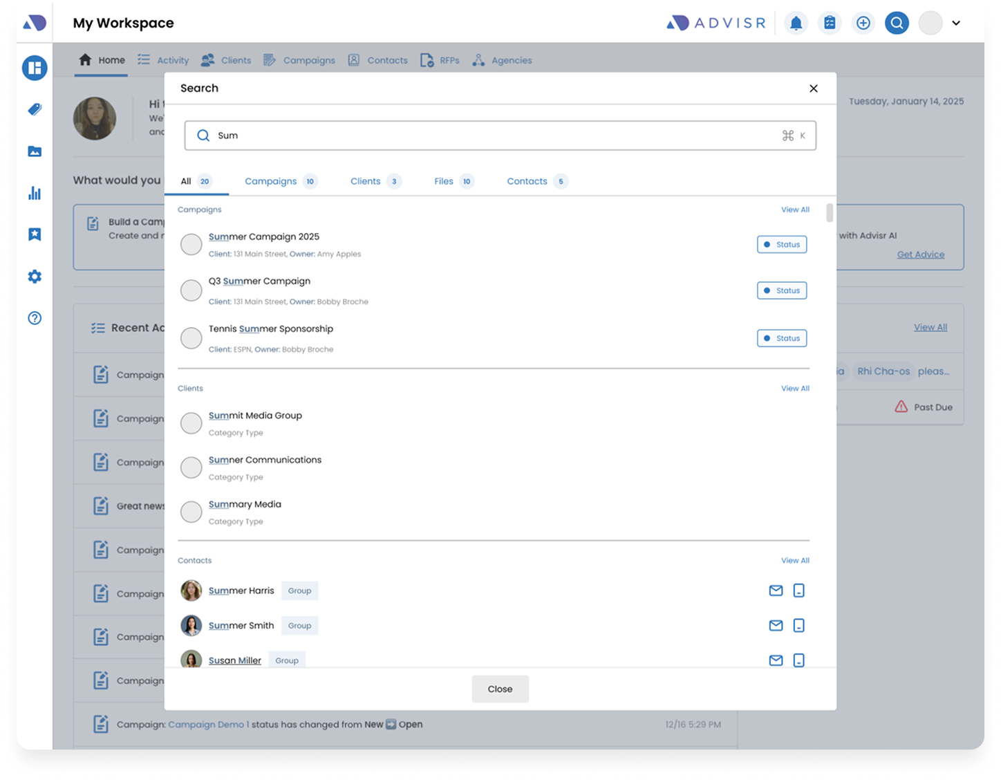
Global Search Bar

Company: Advisr
Role: Product Designer
Device: Desktop
Tools: Figma, G Suite

Users managed growing volumes of campaigns, clients, contacts, and files. Without a centralized way to search,
they spent too much time navigating between modules to find specific information.

Example: A seller needed to pull up a campaign and related client file but had to click through multiple pages to locate both.

Key Pain Points

  • Unified navigation → One entry point to all information.
  • Productivity tools → Take action directly from search.
  • Scalability → Designed to handle large datasets without overwhelming users.
Team Members & Collaborators

This initiative was brought to life through close collaboration across several functions:

Product Manager

Defined requirements and success metrics

Developer

Built the frontend and backend infrastructure

QA Analyst

Ensured quality through testing and feedback cycles

Customer Support

Helped gather early feedback from users

Marketing Team

Supported rollout communications and announcements

My Role

Responsible for research and creating design options to share with the team and make necessary adjustments. 

Hand off designs to Dev and work with QA on ensuring design is implemented correctly.

Research & Ideate

    Research & Gather Requirements

    • Product Manager will provide requirements
    • Look at other examples of search components

    Share Design and gather feedback

    • Share the email templates to gather feedback and make adjustments
    • Work with Marketing for copy

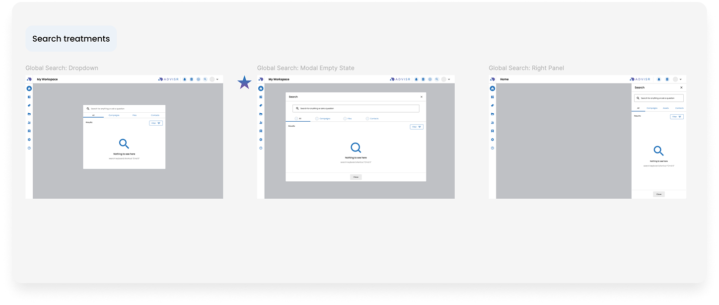
    Design Options

    After conducting research I went ahead and came up with different design options to share with the team

    Spotlight Search Bar

    • Search input field appears on the middle. (ex. Apples Spotlight Search)
    • Once the user inputs a search question.
      The field expands to show the results

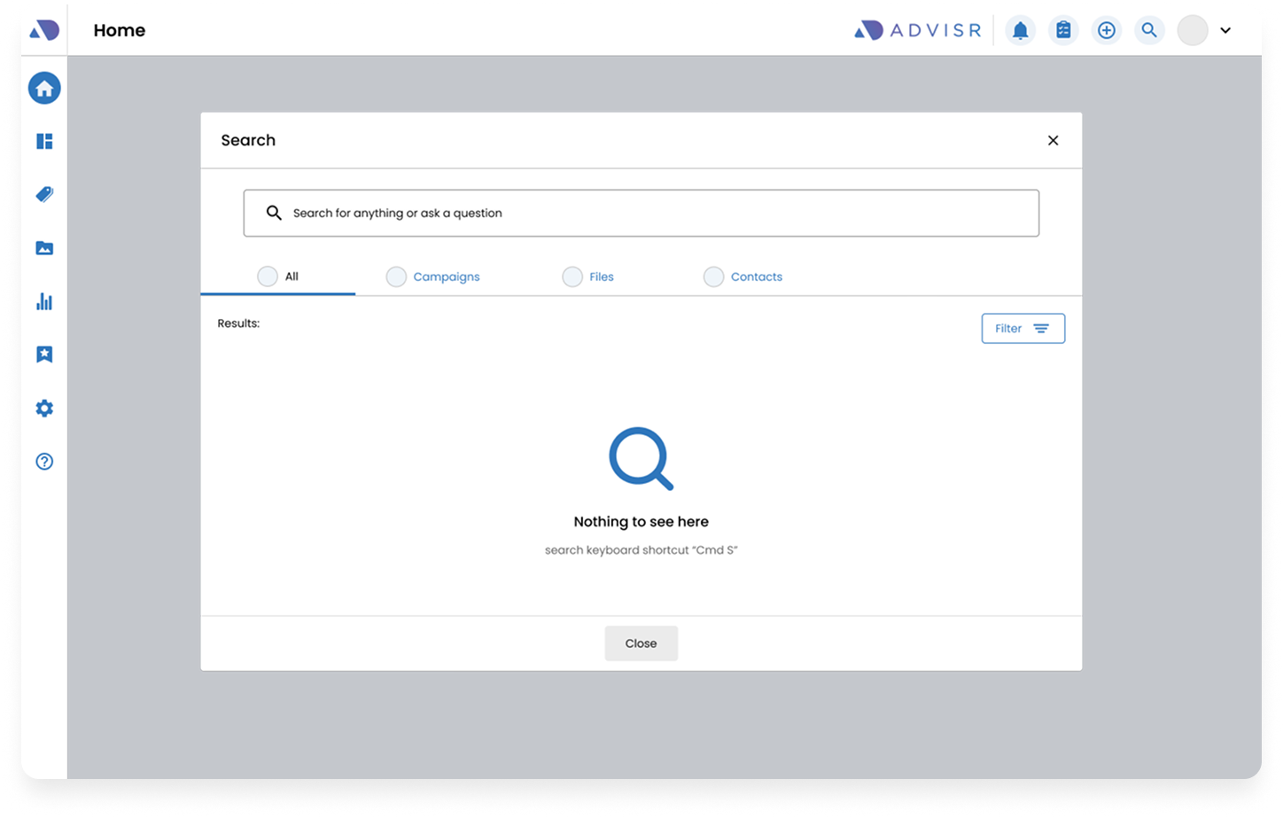
    Modal

    • Using the same modal component as Slides Library
    • Bigger modal to hold more content and more user friendly

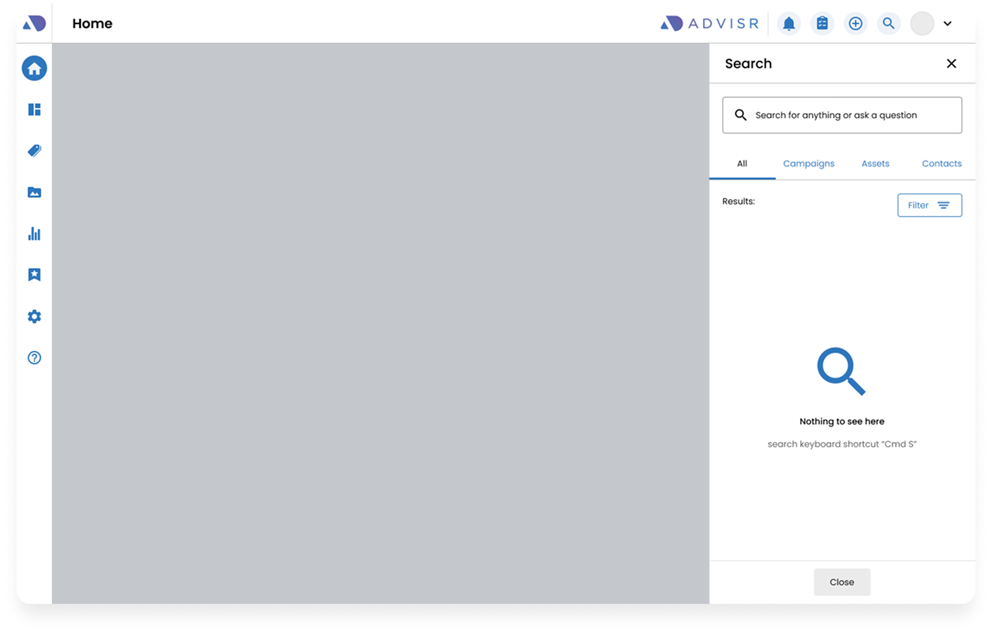
    Right Panel

    • Using the same right panel component as notifications & tasks
    • Easier to dismiss since the panel appears on the right

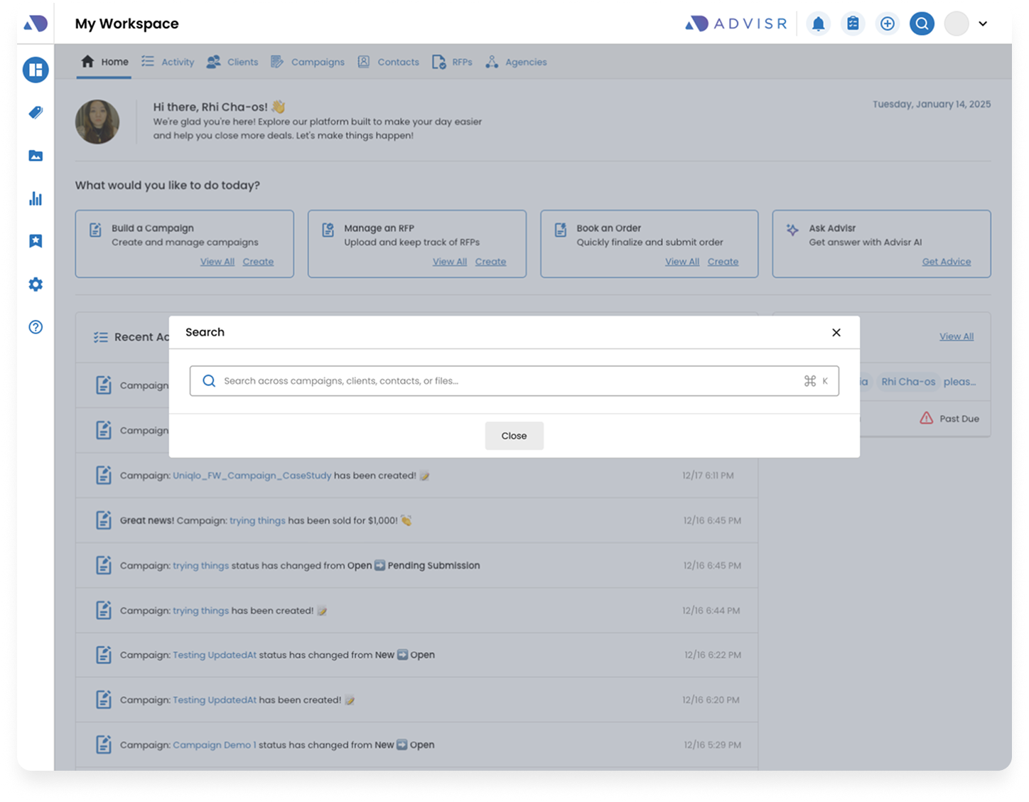
    Final Design

    The Final Design was a combination of Opt 1 and Opt 2.
    The user can access search via the top nav or by using a keyboard shortcut.
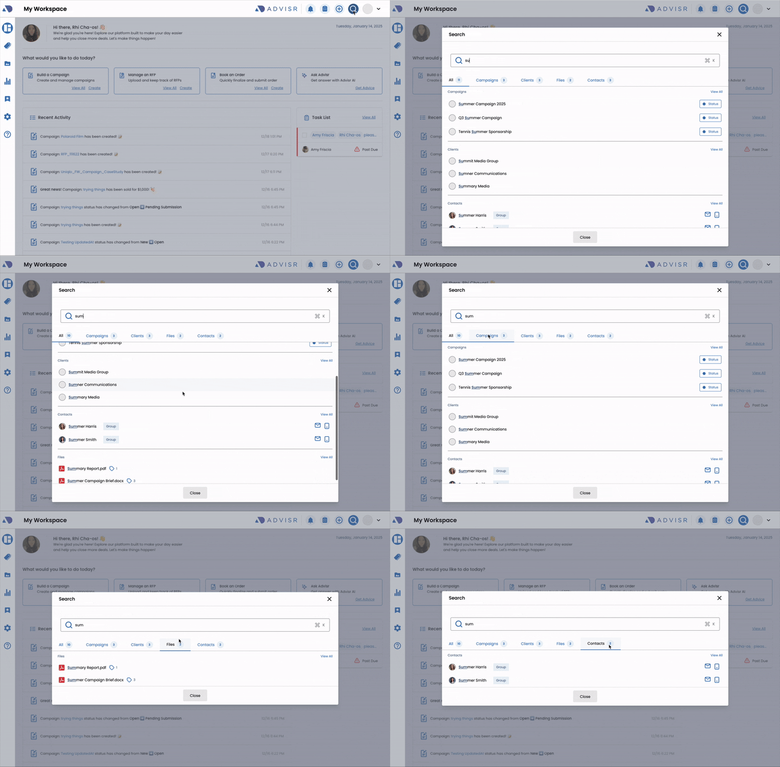
    Spotlight search when the user clicks on
the search icon or keyboard shortcut

    • The modal expands once the user starts typing
    • Results are grouped by category
    • Tabs help organize the results
    • Adding contextual elements like badges for
 campaign status or icons for contacts

    No Results state using friendly text and icon

      Potentially using AdviseMe Ai to show insights

        Takeaways

        • CEO liked the search modal and the potential of incorporating AI elements
        • Users felt this would make finding clients and other assets quickly and liked the keyboard shortcut