Gilt Customer Page Redesign

Company: Gilt
Role: Product Designer
Device: Desktop & Mobile
Tools: Sketch, G Suite, Zeplin
Overview

The customer page has not been updated for years. I decided to take on the task of updating the page as a self initiative project.
I worked closely with Customer Service team who provided context on how they manage the page and pain points from their team as well as from customers.

Team Collaboration

CS Team

Provided context on how the CS page was managed.

Dev Team

Engineers and QA responsible for translating designs into code and ensuring accurate implementation.

My Role

As the Product Designer, I partnered with the CS team to identify pain points and opportunities for improvement.
I designed wireframes and collaborated with developers to ensure a smooth implementation.

Process Steps
Gather Information & Brainstorm
  • Partnered with the Customer Support team to understand how the page was managed and identify key pain points.
  • Brainstormed improvement ideas and defined the content strategy for the page.
  • Organized existing articles into logical categories for easier navigation.
  • Consulted with engineers to determine feasibility and best approaches for implementation.
Research & Sketch
  • Researched other Customer Service pages and industry best practices to guide design decisions.
  • Sketched initial concepts and shared them with the team for early feedback before moving into wireframes.
Wireframe & Gather feedback
  • Created low-fidelity wireframes based on initial feedback.
  • Presented wireframes to the Customer Service team for input.
  • Iterated and refined designs to address feedback.
Finalize Design & Implementation
  • Finalized wireframes and delivered high-fidelity designs to Dev team.
  • Prepared detailed annotations for engineers.
  • Collaborated closely with engineering during development to ensure accurate implementation of the design.

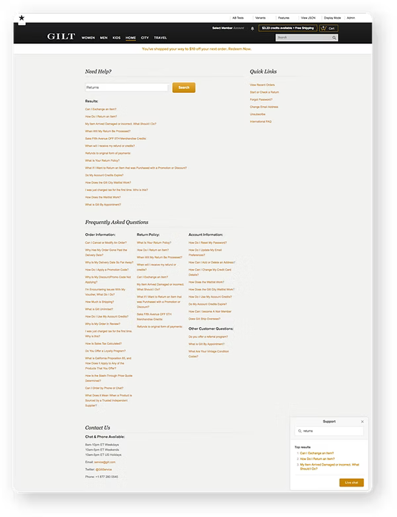
Old Page

The Customer Service page had gone years without updates or maintenance.

While the layout was straightforward, it wasn’t intuitive and users were met with a long list of links that felt overwhelming to scan.

On top of that, a support “chatbot” displayed the same content as the page, creating redundancy and leaving the experience with two competing search bars.

Proposed Improvements

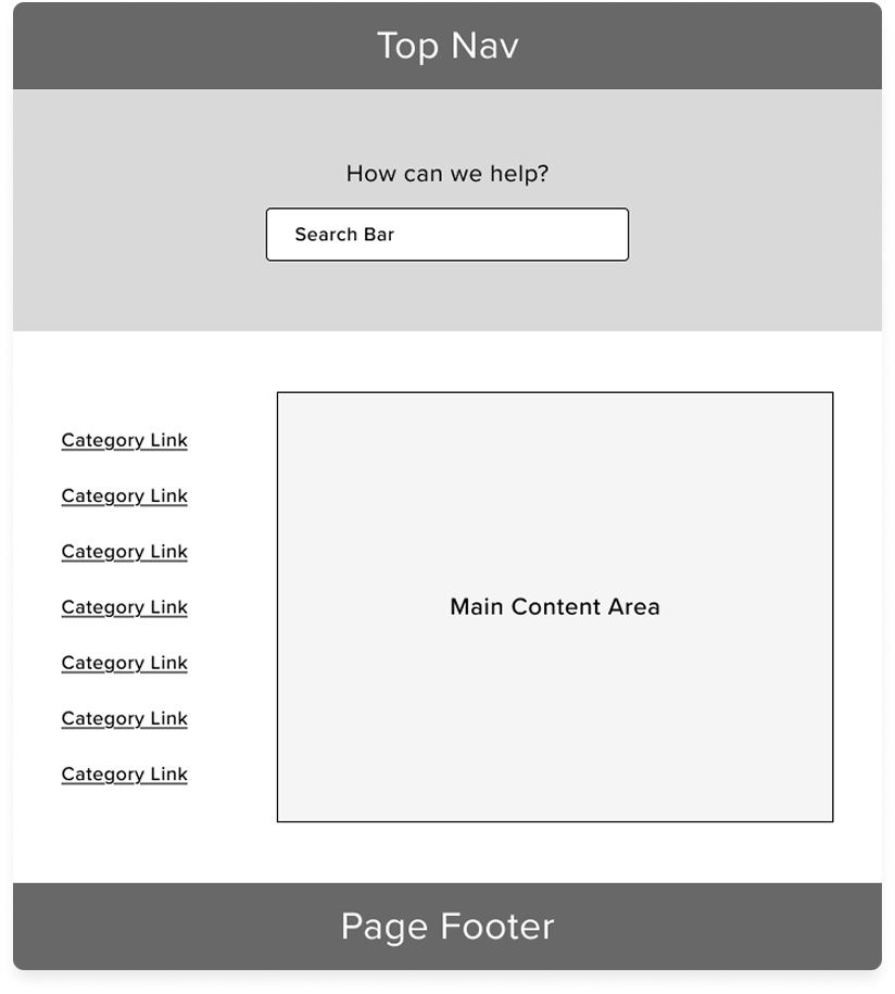
  • Establish a clear content hierarchy to help users quickly understand the structure of the page.
  • Add a hero section at the top with a prominent search bar, making it the primary focus and guiding users toward their next action.
  • Organize support materials into categories, allowing users to easily browse and find relevant articles.
  • Use the main content area to display article lists within each category for more efficient navigation.

Redesigned Help Center Page

Updated design with clearer content hiearchy
and improved user experience.

The new page was powered by ZenDesk.

Responsive Layout

The Customer Page was built responsive to adapt to Desktop & Mobile to ensure the best experiences.

Takeaways

User Feedback

  • The CS team were happy with the updated page. They felt it was easier to manage.
  • Users felt it was easier to find questions to their answers.