Visual Design for Advisr Homepage

Company: Advisr
Role: Visual Designer
Device: Desktop
Tools: Figma, G Suite
Overview

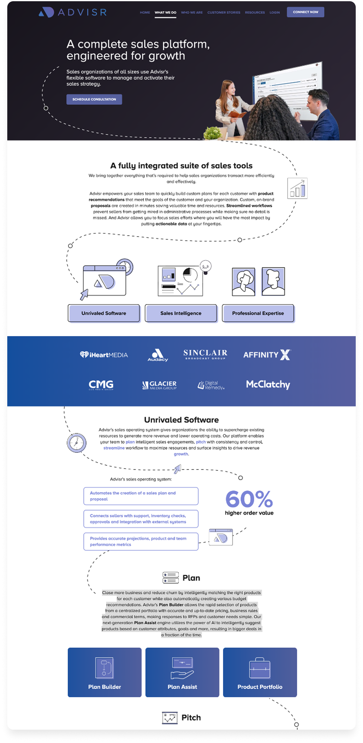
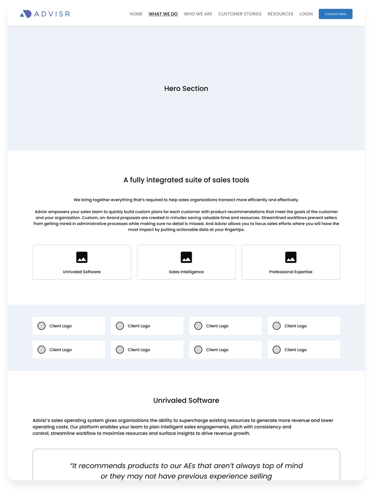
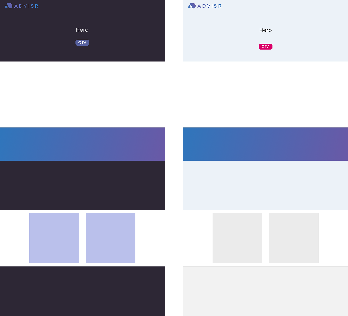
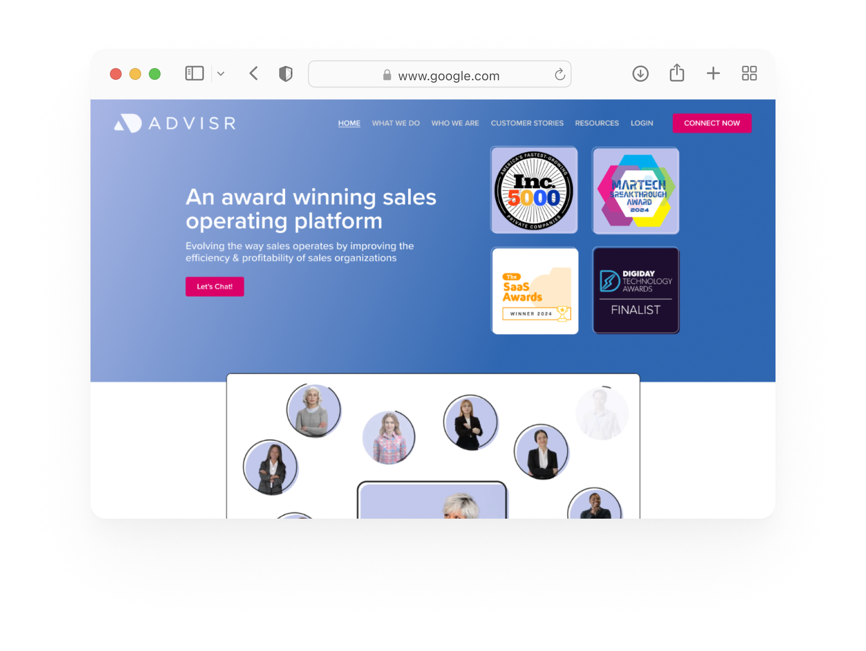
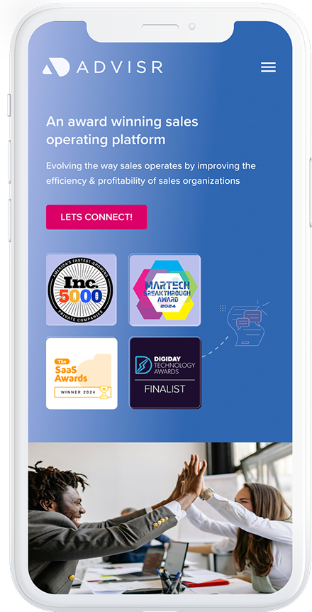
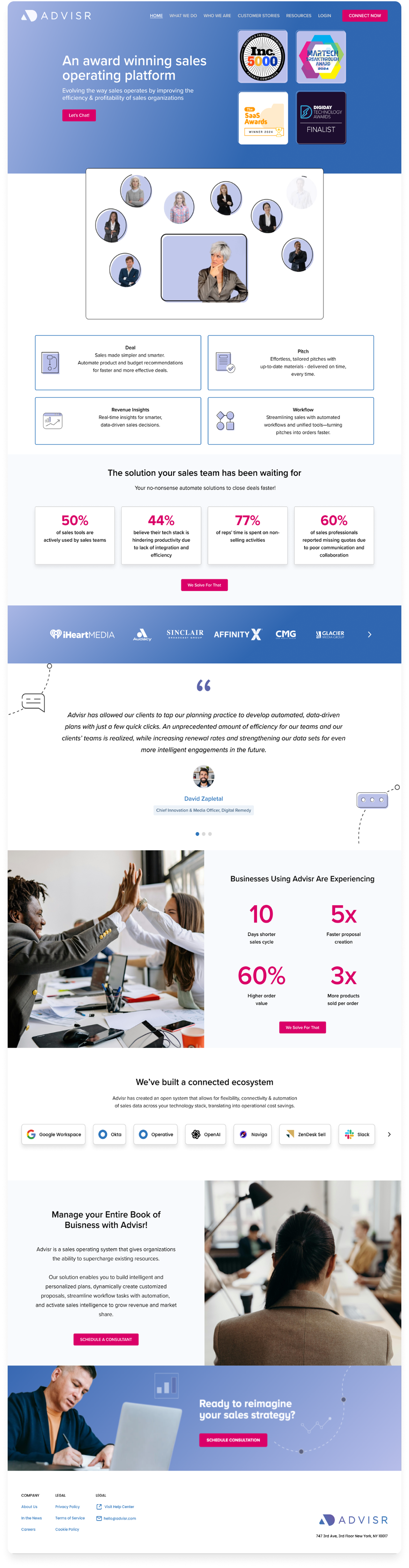
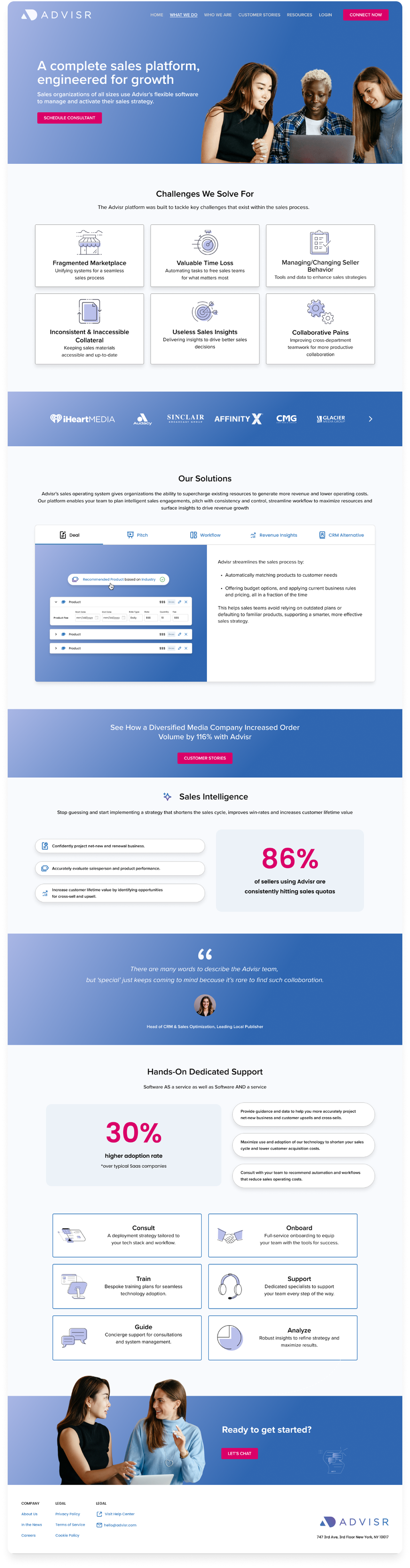
After launching new features, Advisr wanted the landing page to better reflect recent updates.
Customer Success and Marketing also saw this as an opportunity to refresh the page visually.

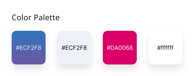
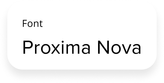
I supported content updates, UI refinements, and added supporting visuals.

Due to a short timeline, the work focused mainly on clarifying content while staying within the existing design system.

Team Collaboration

Customer Success

Shared context around new features and customer needs.

Marketing

Provided updated copy and defined brand voice.

My Role

Collaborated with Customer Success and Marketing on content, updated layouts, created wireframes, and designed visual elements for the homepage.

Timeline

1 month — December 2024

Process

Identifiy the Pain Points

The landing page had several issues:

  • Messaging around the product and company was unclear
  • Content felt text-heavy and hard to scan
  • On smaller screens, long blocks of text required excessive scrolling
  • Visual elements made the page feel busy

Goals

  • Make messaging clearer and easier to understand
  • Improve scannability across devices
  • Simplify the visual experience

Research

Conducted a competitive and comparative analysis of companies in adjacent industries to identify effective UI patterns.

Evaluated how similar organizations structured feature messaging and expressed brand voice to inform content and design decisions.

Share initial layouts and gather feedback

I had weekly meetings with the team and shared layouts to get 
feedback and make changes accordingly.

Worked with Marketing to define page content and reduce copy for better clarity.

Layout & Visual Elements 

Components

Built flexible components that break up information, making the page easier to scan while supporting CS and Marketing needs.

UI elements

Updated the color scheme to better match the platform. Used consistent icons aligned with the product.

Illustrations

Created illustrations to highlight Advisr’s features while keeping the designs minimal, offering just enough detail without exposing the full UI.

Imagery

Refreshed imagery to move away from stock-style visuals and create a more authentic, branded feel.

Responsive Design

Created responsive wireframes for desktop and mobile

Outcome

The updated landing page was clearer, easier to scan, and more visually cohesive.
Simplified content and structured layouts improved readability across screen sizes
while giving teams flexibility for future updates.